Logo

The valantic logo is the central visual element of the brand and stands unambiguously for its values and services. It is always used to clearly identify the communication’s sender.​

Dos and Don'ts

  • The logo may only be used in valantic Black or white.​
  • If valantic Black is not possible for technical reasons, black will be used.​
  • The logo should not be rotated or modified. Outlines are also not allowed.​
  • When positioned on a dark background, the white version of the logo must be used.​
  • When positioned on the valantic Gradient, the white version of the logo must be used. ​
  • When positioned on an image, the white version of the logo must be used – if the contrast suffices, else the valantic Black version. In doing so, the logo must be placed directly on the image. Choose images where the logo comes into its own. Not every image is suitable. To facilitate this robust positioning, a fixed location for the logo is not prescribed. The minimum distance from the edge of the image should, however, be observed in all cases (see Protected Zone).​

Dos

valantic Logo | White Background

Original: valantic Black
valantic Logo | Dark Background

White on dark background

valantic Logo | White on Gradient

White on valantic Gradient

valantic Logo | Black on pale photos

valantic Black on pale photos

valantic Logo | White on dark photos

White on dark photos

Don'ts

valantic Logo | valantic Logo in outline font not allowed

Logo in outline font not allowed!

valantic Logo | Colored logo not allowed

Colored logo not allowed!

valantic Logo | Insufficient contrast

Insufficient contrast!

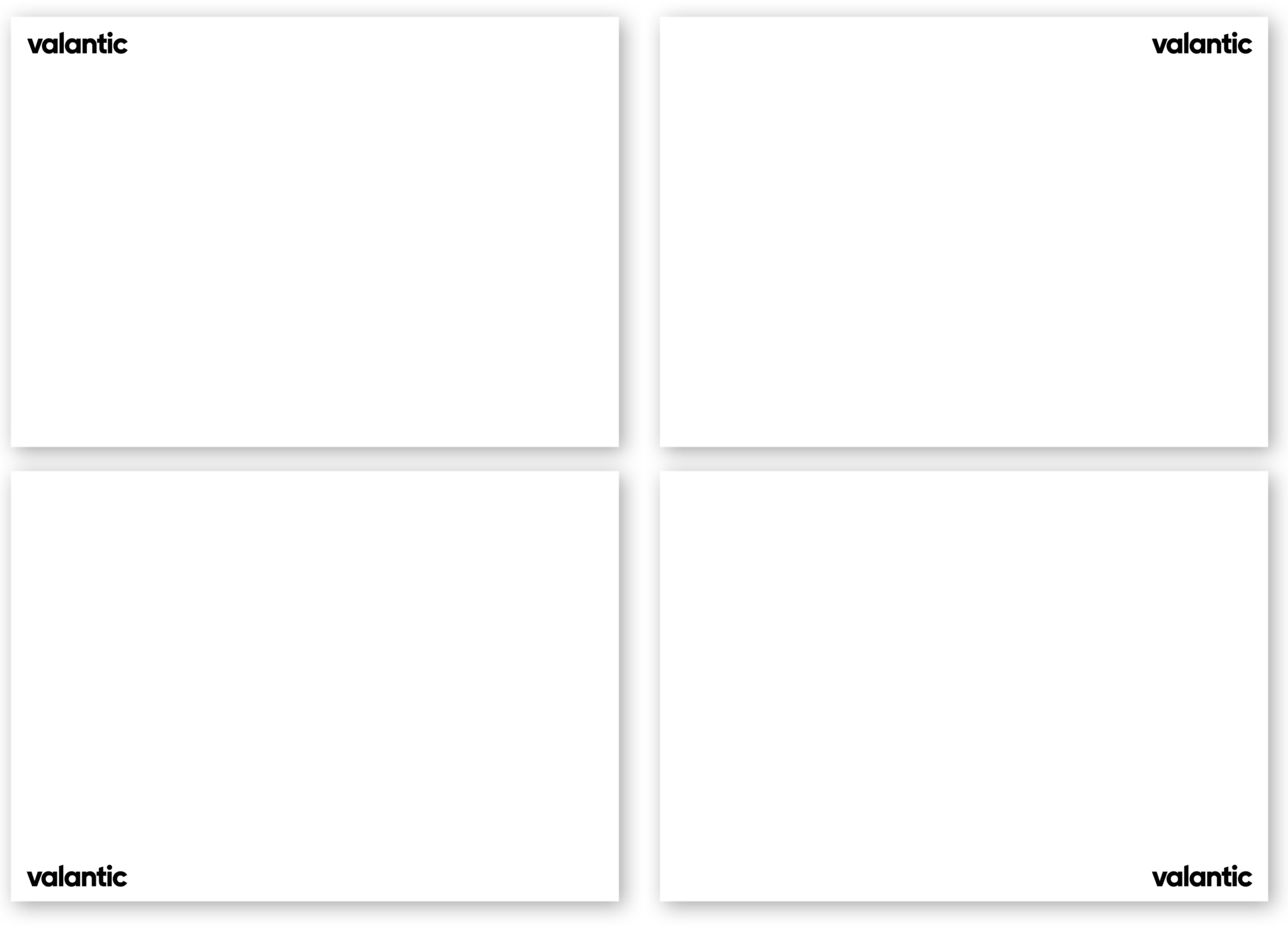
Location: In the corner regions

  • The logo should ideally be placed in the four corner regions of a media format. The specific design of the medium might, however, require a different position for optimally displaying the logo. Please ensure that the logo has a prominent visual impact and clearly proclaims the sender.
  • Using the “v” alone is only allowed in justifiable exceptional situations: for example, in small-format applications (favicon, app icon, …) where the font would be difficult to read, or in special applications and formats. If you would like to use the valantic “v” on its own, please always contact our valantic Design Team to coordinate this (Mailto link: Design Team).
  • The positioning is further elaborated in the various touchpoints.
Logo | Location: in the corner regions

Proportions

You can choose the size of the logo as you wish, but it should be in proportion to the medium concerned and easily recognizable. You can find templates for different formats and applications in the “Touchpoints” section (link). Use these templates whenever possible; it will simplify your work and ensures a consistent design.

The logo must not be less than 4 mm or 15 px high.

Logo | Proportions
Logo | Protected zone

Protected zone

  • Wherever possible, the logo should stand on its own – other visual elements in the immediate vicinity should be avoided. In this way, the logo has the greatest visual impact.
  • A protective distance of one valantic “v” must always be maintained.
  • Additional information (e.g. product or division names) should never be visually attached to the logo. The impression of a compound logo design must never be given.
  • The logo must not be placed on a (free-standing) valantic Shape. The interaction between the logo and the valantic Shape must not give the impression of a figurative mark. In exceptional situations where the logo is to be combined with a free-standing Shape, please coordinate this with the CD team.
Logo | Protected zone: Don'ts

Note for external service providers

valantic GmbH, 80801, Munich, DE is the owner of the word mark (No. 017210436) which we allow you to use. The valantic logo may only be used in unmodified form and for the purposes of valantic GmbH and its subsidiaries. Any other use or forwarding to third parties is only permitted with our written consent.

If you have any questions about using the logo or other aspects of our valantic design, our Design Support team would be happy to help you!

Heike Hunsmann

Heike Hunsmann

Brand Management & Multimedia Content

  • Audio Content
  • Video Content
  • Visual Communication
Sylvia Skarbek | Senior Art Designer

Sylvia Skarbek

Senior Art Designer at valantic

  • Corporate Designer
  • Illustration
  • Post Production
  • Creative Ideas
  • Digital Media
  • Print Media