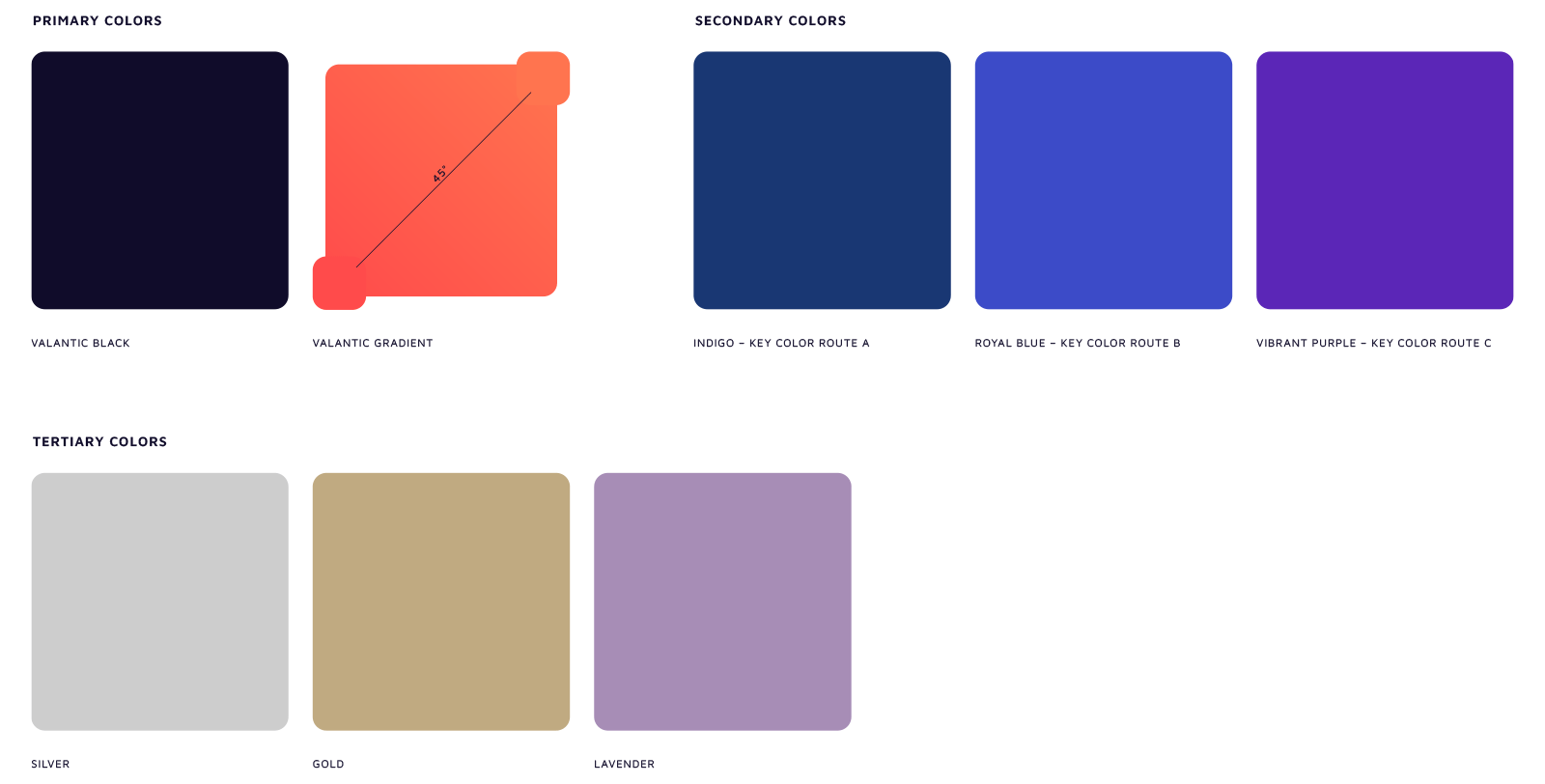
The iconic color Gradient has an immense visual impact on the memorability of the valantic brand. It achieves this through the interplay of the primary colors valantic Coral and valantic Peach. Secondary and tertiary colors supplement the color spectrum; they are used to a lesser extent and to accentuate the content.


The Gradient is supplemented by valantic Black, for example as a font color or as the background color for Dark Mode.

Coral Red
Just used for Gradient
HEX: FF4B4B
RGB: 255 75 75
CMYK: 0 90 65 0
Pantone: 1787

Peach
Just used for Gradient
HEX: FF744F
RGB: 255 115 18
CMYK: 0 70 70 0
Pantone: 171

valantic Black
HEX: 100C2A
RGB: 16 12 42
CMYK: 95 90 45 65
Pantone: 2767
For more variety in infographics, diagrams and digital user interfaces, secondary and tertiary colors are also available. We recommend using secondary and tertiary colors consistently and to a limited extent whenever possible.
Secondary colors
Each Route has one or two colors – secondary colors – to supplement the valantic Gradient. Secondary colors should be used as little as possible and to maximize accentuation.

Indigo
Secondary colors for Route A
HEX: 193773
RGB: 25 55 115
CMYK: 100 84 26 11
Pantone: 654

Royal Blue
Secondary colors for Route B
HEX: 3C4BC8
RGB: 60 75 200
CMYK: 90 73 0 0
Pantone: 2728

Vibrant Purple
Secondary colors for Route C
HEX: 5B26B7
RGB: 91 38 183
CMYK: 84 88 0 0
Pantone: Violet
Tertiary Colors

Gold
HEX: C0AA81
RGB: 192 170 129
CMYK: 23 26 50 10
Pantone: 466 optional 871 (matallic)

Silver
HEX: CDCDCD
RGB: 205 205 205
CMYK: 0 0 0 27
Pantone: Cool Gray 3

Lavender
HEX: A78DB6
RGB: 167 141 182
CMYK: 40 46 0 0
Pantone: 2645
The color distribution should not be considered from a mathematical perspective. Rather, it is about the visual impression created when looking at the individual touchpoints of the Routes.

The color distribution should not be considered from a mathematical perspective. Rather, it is about the visual impression created when looking at the individual touchpoints of the Routes.
