Welcome to the valantic Brand Portal

This portal is designed to provide you with all the necessary tools, guidelines, and resources to ensure consistency and coherence across all our communications. Whether you are creating a presentation, designing marketing materials, or engaging with our community, the style guide and brand portal will guide you through the nuances of our brand's aesthetics. Here, you'll find detailed instructions ensuring that every piece of content aligns with our brand's values and visual identity. This portal is not just a set of rules but a resource to inspire creativity while maintaining the integrity of our brand.

What is the Liquid Brand Design and why do we have it?

Challenges

Our challenge: Many Target Groups & One Brand

  • We serve different target groups across valantic
  • Target groups cannot be assigned to competence centers or divisions – there are overlaps
  • Each division has common touchpoints with other divisions
  • But still each division has its own area of activity and unique selling points
  • Our growth, new technologies, business areas and user needs pose new challenges for the brand identity
  • Efficient rebranding projects of new CC are problematic due to lack of clear design guidelines
  • Job applicants and customers alike are irritated by many different designs on our external channels (web, social, ads)
Solution

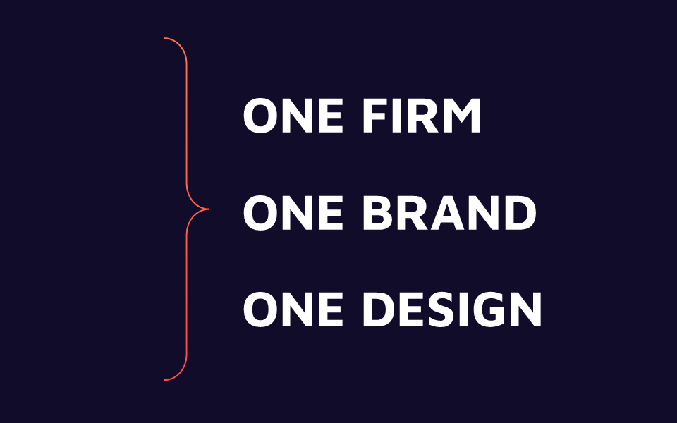
The solution: A Liquid Brand Design

Design flexibly for specific target groups with distinct brand recognition through consistent visuals.

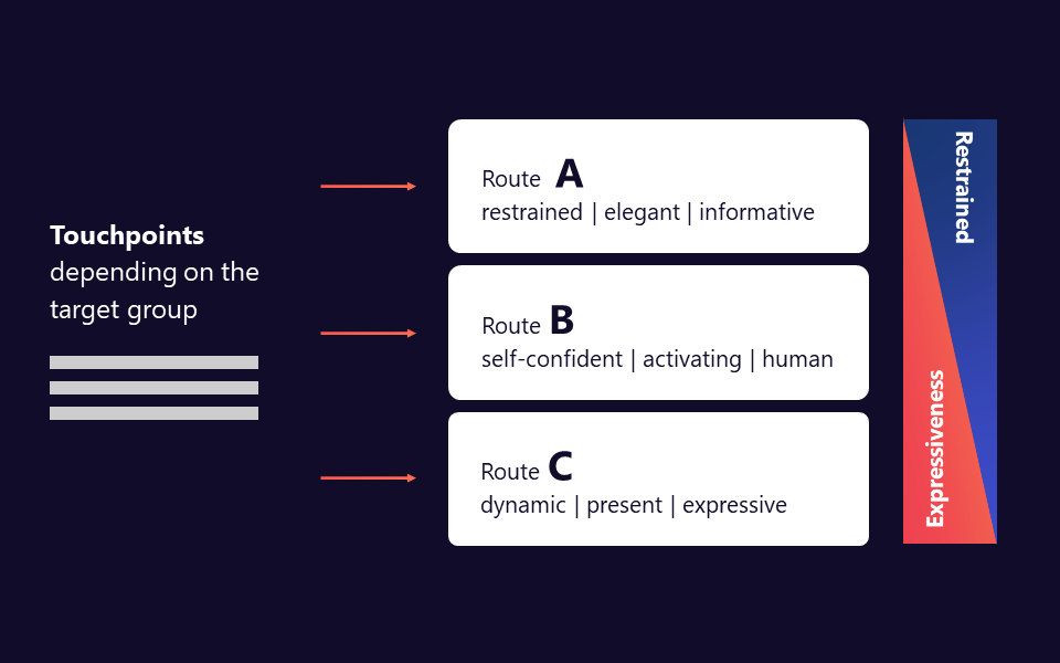
This means we offer tailored flexibility for specific audiences: Three design approaches enable distinct visual communication for various target groups and contexts.

  • Route A: restrained | elegant | informative
  • Route B: self-confident | activating | human
  • Route C: dynamic | present | expressive
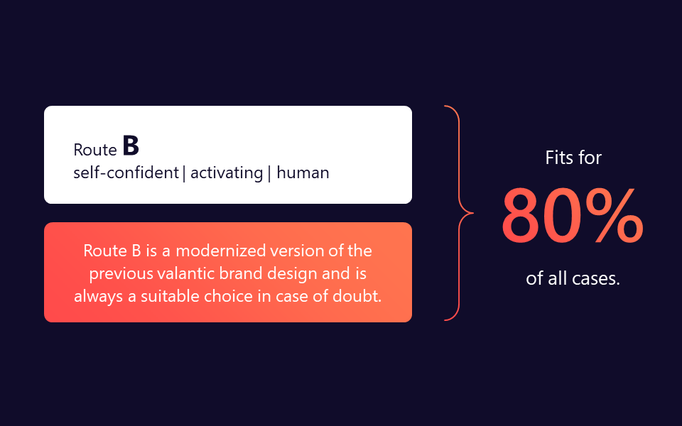
80Percent

How to Choose a Route

The choice of the appropriate route depends on the target group, the touchpoint and the message.

Ask yourself

  • Who do you want to address, who is your target group?
  • How do you want to be perceived?
  • In what context do you want to present?

These considerations should not play a role in the choice of route

  • Which route do I personally like best?
  • These designs are finally something different I could use.
  • I don’t like orange/blue/purple.

When in doubt: Route B is always a good choice.

How to use the different Routes

Route A

restrained | elegant | informativ

This Route can be used for example:

  • Conservative industries, such as insurance and banking
  • High-probity services, such as finance, legal and data privacy
  • Informative customer communication, such as invoices and data sheets

Route B

self-confident | activating | human

This Route can be used for example:

  • Internal Communication
  • Agile customers and sectors, such as IT, manufacturing and automotive
  • Services involving entire teams, such as development and product implementation teams

Route C

dynamic | present | expressive

This Route can be used for example:

  • Recruiting events and fairs in which we want to stand-out
  • Addressing Marketing people and start-up customers
  • Zeitgeist-sensitive industries, such as tourism and consumer goods
  • Agency-related services, such as e-commerce and design

Summary

  1. 1

    You are now flexible in targeting specific audiences while retaining unmistakable recognizably.

  2. 2

    Choose from three different Routes the one that best underlines your message.

  3. 3

    Be consistent in your choice and stick to the Basic Rules.

  4. 4

    Always use the four valantic Basic Brand Elements in your visual messages.

valantic Basic Brand Elements

The basic elements are mandatory at the most memorable and striking level of a medium

The valantic Brand Design is based on fixed design elements: the so-called Basic Elements. They define the visual characteristics of all the content needed in the communication. Their consistent use serves to further enhance the memorability of the brand.

  • The four valantic Basic Brand Elements – logo, gradient, valantic Shape, typeface – have the greatest impact on brand memorability.
  • Their use is therefore mandatory at the most memorable level of a medium.
  • The most memorable level of a medium is, for example, a title page or web page (header) – which we also call the “Hero” area.
valantic Brand Assets

Find out more about the valantic Basic Brand Elements

Logo

Logo
Logo

Typography

Typography
Typography

Colors

Colors
Colors

Brand Shape

Brand Shape
Brand Shape

Imagery

Imagery
Imagery